
GHOST OF TSUSHIMA TITLES

As part of a Ringling course, we were tasked to create a short title reveal for the upcoming Ghost of Tsushima film. This was practice in working with color spaces and high definition exporting, as well as finding a new way to utilize branding while remaining consistent to the existing material with very limited time.
Approaches
Ghost of Tsushima is originally a 2020 video game created by Sucker Punch Studios, and is currently being adapted in a film, slated to release in 2027. The story follows Jin Sakai, last remaining member and samurai of the Sakai clan. After he and his allies face catastrophic defeat in the face of a Mongol invasion, Jin must utilize a combination of direct combat and stealth that earns him the title of "ghost". Jin must also wage an internal war, between the honor ingrained into him from his samurai training, and the dishonarable actions he must take in order to free Japan.

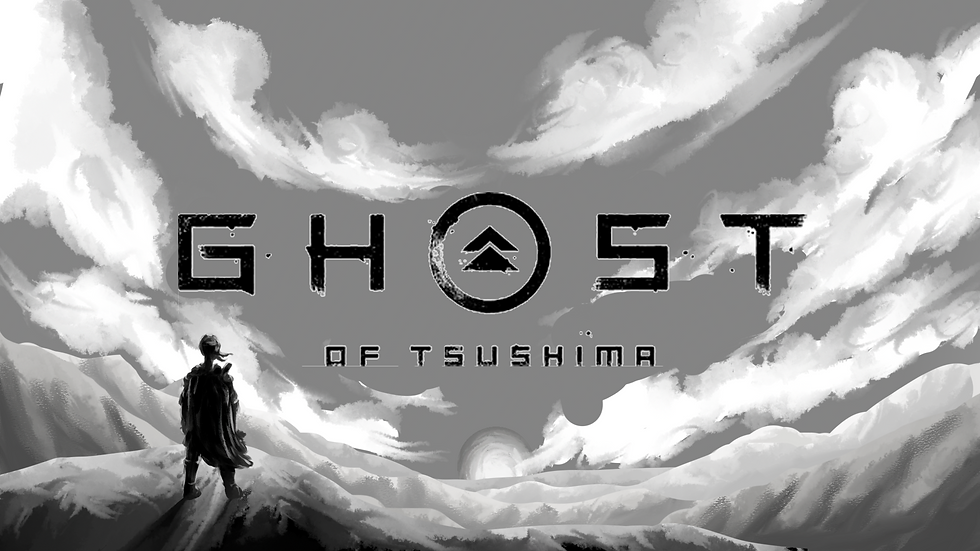
For the titles, I presented two separate proposals. The first, titled Setting Sun, was inspired by the game's focus on creating beautiful environments and by the brushstrokes present in the existing title branding. The visuals also were inspired by the English translation of Nippon (the Japanese name for the country), which dubs it "the land of the rising sun". The large, ominous sun dips below the mountains, symbolizing the existential threat the Mongols pose to Japan, and the long shadows obscuring the lonely figure of Jin represent his own internal conflict.

Because I enjoy illustrating, and to ensure there would be an appealing version, I created several alternate takes on the composition, varying the position of Jin's silhouette to best emphasize his lonely task, and the clouds to frame the scene in the most engaging way. For speed, the frames were designed in greyscale, but I included a color test of one of the frames in order to convey my intended palette.


Written in Blood, the second concept, is motivated by the theme of death, which persists strongly throughout the game. The events of the story are kicked off by a massacre, which I envisioned being the cold open of the film, capped off with this reveal. The pale ground represents Japan's sanctity, being stained by the blood of its own warriors who fought and died to keep it free. The kanji the bloodstains form the word kuroudo, translating roughly as "dark person", specifically in the context of Jin's forced abandonment of his honor. The tattered text was meant to reinforce the gravity and danger of the circumstances.


Style Development
Based on notes taken during the pitch, Written in Blood was selected, and the design revisions began. The primary note was swapping in the game's official wordmark as opposed to the created one. The visceral nature of this concept also lent itself better to less darker, more textured visuals that appeared more realistic than graphic. The bloodstains needed look more like they were soaking into the earth, rather than simply laying on top of it.

Animation
The design direction having been refined, animation was the next step. Of course, the style continued to evolve as the animation progressed, but the focus was now on finding motion that integrated the idea as strongly as possible. After Effects was the natural choice with a flat, relatively still composition. I found that I could convincingly make the blood look as though it were flowing using shape layers and the roughen edges effect on the kanji edited in Photoshop.

The blood was too animated, however, and distracted from the title reveal that was, in the end, most important in a project about creating a title reveal, much to everyone's shock, I'm sure. The blood's movement was reduced in favor of adding more interest to the unveiling of the logotype. Some of the ideas behind the Setting Sun concept were re-integrated, with the type now being revealed as if it were being painted on. The vibrancy and contrast also was enhanced, increasing the sense of intensity. The conclusion of the track "Way of the Ghost" was also integrated at this stage (hover cursor to listen).

Tactile Masking
The shape layer approach was used to circumvent a lack of satisfactory footage of liquid oozing being available to me. Another way of solving this problem was to shoot my own oozing blood to create the most convincing mask possible in AE.

Just kidding, it was food coloring. Though in the end I was not satisfied with the masks I created in this way either, I appreciated a rare opportunity to do some tactile work, as time often precludes doing so.

FINAL
After a few more rounds of polish and careful color management, the titles were finished. The project required both an HD version for home release and a widescreen version protected by a 16:9 container for theaters. Exporting the After Effects file provided some challenges, as its compatibility with the Rec.2020 colorspace was spotty at best, the output and exporting color treatment never seemed to match. With enough trial and error though, I believe that this looks better than it did within the program.

